Heart Failure Prediction
데이터 셋: https://www.kaggle.com/andrewmvd/heart-failure-clinical-data
환자들에게 주어지는 다양한 변수를 통해 죽음의 가능성을 밝혀내는 데이터 셋이다.
라이브러리 설정 및 데이터 불러오기
import pandas as pd
import numpy as np
import seaborn as sns
import matplotlib.pyplot as plt
df = pd.read_csv('C:/Users/dissi/Kaggle Practice/heart_failure_clinical_records_dataset.csv')
df.head()
| age | anaemia | creatinine_phosphokinase | diabetes | ejection_fraction | high_blood_pressure | platelets | serum_creatinine | serum_sodium | sex | smoking | time | DEATH_EVENT | |
|---|---|---|---|---|---|---|---|---|---|---|---|---|---|
| 0 | 75.0 | 0 | 582 | 0 | 20 | 1 | 265000.00 | 1.9 | 130 | 1 | 0 | 4 | 1 |
| 1 | 55.0 | 0 | 7861 | 0 | 38 | 0 | 263358.03 | 1.1 | 136 | 1 | 0 | 6 | 1 |
| 2 | 65.0 | 0 | 146 | 0 | 20 | 0 | 162000.00 | 1.3 | 129 | 1 | 1 | 7 | 1 |
| 3 | 50.0 | 1 | 111 | 0 | 20 | 0 | 210000.00 | 1.9 | 137 | 1 | 0 | 7 | 1 |
| 4 | 65.0 | 1 | 160 | 1 | 20 | 0 | 327000.00 | 2.7 | 116 | 0 | 0 | 8 | 1 |
df.info()
<class 'pandas.core.frame.DataFrame'>
RangeIndex: 299 entries, 0 to 298
Data columns (total 13 columns):
 #   Column                    Non-Null Count  Dtype
---  ------                    --------------  -----
 0   age                       299 non-null    float64
 1   anaemia                   299 non-null    int64
 2   creatinine_phosphokinase  299 non-null    int64
 3   diabetes                  299 non-null    int64
 4   ejection_fraction         299 non-null    int64
 5   high_blood_pressure       299 non-null    int64
 6   platelets                 299 non-null    float64
 7   serum_creatinine          299 non-null    float64
 8   serum_sodium              299 non-null    int64
 9   sex                       299 non-null    int64
 10  smoking                   299 non-null    int64
 11  time                      299 non-null    int64
 12  DEATH_EVENT               299 non-null    int64
dtypes: float64(3), int64(10)
memory usage: 30.5 KB
- age : 나이
- anaemia : 빈혈증 여부 (0 = 무, 1 = 유)
- creatinine_phosphokinase : 크레아틴키나제 검사 결과
- diabetes : 당뇨병 여부
- ejection_fraction : 박출계수
- high_blood_pressure : 고혈압 여부
- platelets : 혈소판 수
- serum_creatinine : 혈중 크레아틴 레벨
- serum_sodium : 혈중 나트륨 레벨
- sex : 성별 (0 = 여성, 1 = 남성)
- smoking : 흡연여부 (0 = 비흡연, 1 = 흡연)
- time : 관찰기간(일)
- DEATH_EVENT: 사망여부 ( 0 = 생존, 1 = 사망)
EDA 및 기초 통계 분석
수치형 데이터
df.describe()
| age | anaemia | creatinine_phosphokinase | diabetes | ejection_fraction | high_blood_pressure | platelets | serum_creatinine | serum_sodium | sex | smoking | time | DEATH_EVENT | |
|---|---|---|---|---|---|---|---|---|---|---|---|---|---|
| count | 299.000000 | 299.000000 | 299.000000 | 299.000000 | 299.000000 | 299.000000 | 299.000000 | 299.00000 | 299.000000 | 299.000000 | 299.00000 | 299.000000 | 299.00000 |
| mean | 60.833893 | 0.431438 | 581.839465 | 0.418060 | 38.083612 | 0.351171 | 263358.029264 | 1.39388 | 136.625418 | 0.648829 | 0.32107 | 130.260870 | 0.32107 |
| std | 11.894809 | 0.496107 | 970.287881 | 0.494067 | 11.834841 | 0.478136 | 97804.236869 | 1.03451 | 4.412477 | 0.478136 | 0.46767 | 77.614208 | 0.46767 |
| min | 40.000000 | 0.000000 | 23.000000 | 0.000000 | 14.000000 | 0.000000 | 25100.000000 | 0.50000 | 113.000000 | 0.000000 | 0.00000 | 4.000000 | 0.00000 |
| 25% | 51.000000 | 0.000000 | 116.500000 | 0.000000 | 30.000000 | 0.000000 | 212500.000000 | 0.90000 | 134.000000 | 0.000000 | 0.00000 | 73.000000 | 0.00000 |
| 50% | 60.000000 | 0.000000 | 250.000000 | 0.000000 | 38.000000 | 0.000000 | 262000.000000 | 1.10000 | 137.000000 | 1.000000 | 0.00000 | 115.000000 | 0.00000 |
| 75% | 70.000000 | 1.000000 | 582.000000 | 1.000000 | 45.000000 | 1.000000 | 303500.000000 | 1.40000 | 140.000000 | 1.000000 | 1.00000 | 203.000000 | 1.00000 |
| max | 95.000000 | 1.000000 | 7861.000000 | 1.000000 | 80.000000 | 1.000000 | 850000.000000 | 9.40000 | 148.000000 | 1.000000 | 1.00000 | 285.000000 | 1.00000 |
- 범주형 데이터 경우 0과 1로 분류되며 대부분의 평균값이 0.5 인것으로 미루어 보아 균형잡힌 데이터라 할 수 있다.
- 크레아틴 키나제 경우 최소와 최대 차이가 큰데 최대값이 평균값과 과도하게 차이가 나는 것으로보아 최대값은 아웃라이어 값이라 할 수 있다.
- 혈소판 수 역시 중위값 75% 값에 비해 최대값이 차이가 있음. 아웃라이어로 판단하기는 부족하지만 주목할만한 값임.
- 크레아틴 레벨 역시 최대값이 아웃라이어
sns.histplot(data=df, x='age')
<matplotlib.axes._subplots.AxesSubplot at 0x1c0cda0c908>

sns.histplot(data=df, x='age', hue='DEATH_EVENT')

# 80세 이후로 사망횟수가 생존보다 높다.
<matplotlib.axes._subplots.AxesSubplot at 0x1c0ce184308>

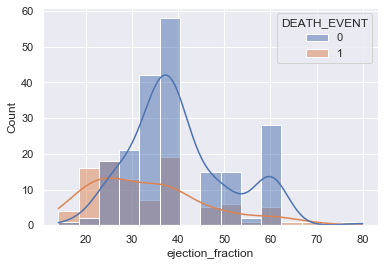
sns.histplot(data=df, x='ejection_fraction', hue='DEATH_EVENT', kde=True)
<matplotlib.axes._subplots.AxesSubplot at 0x1c0ce28de08>
sns.histplot(data=df, x='platelets', hue='DEATH_EVENT')

# 정규분포의 형태 사망역시 마찬가지로 혈소판수는 사망여부에 큰 영향을 주진 않음.
<matplotlib.axes._subplots.AxesSubplot at 0x1c0ce2c5508>

범주형 데이터
sns.boxplot(data=df, x='DEATH_EVENT', y='ejection_fraction')

# 생존한 사람들이 박출계수가 상대적으로 높음.
<matplotlib.axes._subplots.AxesSubplot at 0x1c0ce4b5e08>

sns.violinplot(data=df, x='DEATH_EVENT', y='ejection_fraction', hue='smoking')
<matplotlib.axes._subplots.AxesSubplot at 0x1c0ce5e2dc8>

모델 학습을 위한 전처리
df.columns
Index(['age', 'anaemia', 'creatinine_phosphokinase', 'diabetes',
       'ejection_fraction', 'high_blood_pressure', 'platelets',
       'serum_creatinine', 'serum_sodium', 'sex', 'smoking', 'time',
       'DEATH_EVENT'],
      dtype='object')
from sklearn.preprocessing import StandardScaler

X_num = df[['age', 'creatinine_phosphokinase',
       'ejection_fraction', 'platelets',
       'serum_creatinine', 'serum_sodium', 'time']]
        # 수치형 데이터

X_cat = df[['anaemia','diabetes','high_blood_pressure','sex', 'smoking']]
        # 범주형 데이터

y = df['DEATH_EVENT']
# 표준화 작업 (평균빼주고 편차로 나누어준다.)
scaler = StandardScaler()
scaler.fit(X_num)
X_scaled = scaler.transform(X_num)
X_scaled = pd.DataFrame(data=X_scaled, index=X_num.index, columns=X_num.columns)
X = pd.concat([X_scaled, X_cat], axis=1)
X
| age | creatinine_phosphokinase | ejection_fraction | platelets | serum_creatinine | serum_sodium | time | anaemia | diabetes | high_blood_pressure | sex | smoking | |
|---|---|---|---|---|---|---|---|---|---|---|---|---|
| 0 | 1.192945 | 0.000166 | -1.530560 | 1.681648e-02 | 0.490057 | -1.504036 | -1.629502 | 0 | 0 | 1 | 1 | 0 |
| 1 | -0.491279 | 7.514640 | -0.007077 | 7.535660e-09 | -0.284552 | -0.141976 | -1.603691 | 0 | 0 | 0 | 1 | 0 |
| 2 | 0.350833 | -0.449939 | -1.530560 | -1.038073e+00 | -0.090900 | -1.731046 | -1.590785 | 0 | 0 | 0 | 1 | 1 |
| 3 | -0.912335 | -0.486071 | -1.530560 | -5.464741e-01 | 0.490057 | 0.085034 | -1.590785 | 1 | 0 | 0 | 1 | 0 |
| 4 | 0.350833 | -0.435486 | -1.530560 | 6.517986e-01 | 1.264666 | -4.682176 | -1.577879 | 1 | 1 | 0 | 0 | 0 |
| ... | ... | ... | ... | ... | ... | ... | ... | ... | ... | ... | ... | ... |
| 294 | 0.098199 | -0.537688 | -0.007077 | -1.109765e+00 | -0.284552 | 1.447094 | 1.803451 | 0 | 1 | 1 | 1 | 1 |
| 295 | -0.491279 | 1.278215 | -0.007077 | 6.802472e-02 | -0.187726 | 0.539054 | 1.816357 | 0 | 0 | 0 | 0 | 0 |
| 296 | -1.333392 | 1.525979 | 1.854958 | 4.902082e+00 | -0.575031 | 0.312044 | 1.906697 | 0 | 1 | 0 | 0 | 0 |
| 297 | -1.333392 | 1.890398 | -0.007077 | -1.263389e+00 | 0.005926 | 0.766064 | 1.932509 | 0 | 0 | 0 | 1 | 1 |
| 298 | -0.912335 | -0.398321 | 0.585389 | 1.348231e+00 | 0.199578 | -0.141976 | 1.997038 | 0 | 0 | 0 | 1 | 1 |
299 rows × 12 columns
학습, 테스트 데이터 분리
from sklearn.model_selection import train_test_split
X_train, X_test, y_train, y_test = train_test_split(X, y, test_size=0.3, random_state=1)
분류하기
선형회귀모델
from sklearn.linear_model import LogisticRegression

model_lr = LogisticRegression()
model_lr.fit(X_train, y_train)
LogisticRegression(C=1.0, class_weight=None, dual=False, fit_intercept=True,
                   intercept_scaling=1, l1_ratio=None, max_iter=100,
                   multi_class='auto', n_jobs=None, penalty='l2',
                   random_state=None, solver='lbfgs', tol=0.0001, verbose=0,
                   warm_start=False)
from sklearn.metrics import classification_report

pred = model_lr.predict(X_test)
print(classification_report(y_test, pred))
              precision    recall  f1-score   support

           0       0.86      0.92      0.89        64
           1       0.76      0.62      0.68        26

    accuracy                           0.83        90
   macro avg       0.81      0.77      0.78        90
weighted avg       0.83      0.83      0.83        90
앙상블 모델 (XGBoost)
from xgboost import XGBClassifier

model_xgb = XGBClassifier()
model_xgb.fit(X_train, y_train)
[21:28:13] WARNING: C:/Users/Administrator/workspace/xgboost-win64_release_1.3.0/src/learner.cc:1061: Starting in XGBoost 1.3.0, the default evaluation metric used with the objective 'binary:logistic' was changed from 'error' to 'logloss'. Explicitly set eval_metric if you'd like to restore the old behavior.


C:\Users\dissi\anaconda31\lib\site-packages\xgboost\sklearn.py:888: UserWarning: The use of label encoder in XGBClassifier is deprecated and will be removed in a future release. To remove this warning, do the following: 1) Pass option use_label_encoder=False when constructing XGBClassifier object; and 2) Encode your labels (y) as integers starting with 0, i.e. 0, 1, 2, ..., [num_class - 1].
  warnings.warn(label_encoder_deprecation_msg, UserWarning)


XGBClassifier(base_score=0.5, booster='gbtree', colsample_bylevel=1,
              colsample_bynode=1, colsample_bytree=1, gamma=0, gpu_id=-1,
              importance_type='gain', interaction_constraints='',
              learning_rate=0.300000012, max_delta_step=0, max_depth=6,
              min_child_weight=1, missing=nan, monotone_constraints='()',
              n_estimators=100, n_jobs=4, num_parallel_tree=1,
              objective='binary:logistic', random_state=0, reg_alpha=0,
              reg_lambda=1, scale_pos_weight=1, subsample=1,
              tree_method='exact', use_label_encoder=True,
              validate_parameters=1, verbosity=None)
pred = model_xgb.predict(X_test)
print(classification_report(y_test, pred))
              precision    recall  f1-score   support

           0       0.95      0.91      0.93        64
           1       0.79      0.88      0.84        26

    accuracy                           0.90        90
   macro avg       0.87      0.90      0.88        90
weighted avg       0.91      0.90      0.90        90
앙상블 모델 분석 (어떤 feature가 가장 많은 영향을 미치는지)
plt.bar(X.columns, model_xgb.feature_importances_)
plt.xticks(rotation=90)
plt.show()

- time 이 가장 중요요소로 나타나지만 time과 death_event경우 밀접한 상관관계를 가진다. 즉 correlation이 높음.
- 관찰 도중 death_event가 발생하면 time도 끝나기 때문. time 배제해야함.
재학습
X_num = df[['age', 'creatinine_phosphokinase','ejection_fraction', 'platelets',
            'serum_creatinine', 'serum_sodium']]
        # 수치형 데이터

X_cat = df[['anaemia','diabetes','high_blood_pressure','sex', 'smoking']]
        # 범주형 데이터

y = df['DEATH_EVENT']

scaler = StandardScaler()
scaler.fit(X_num)
X_scaled = scaler.transform(X_num)
X_scaled = pd.DataFrame(data=X_scaled, index=X_num.index, columns=X_num.columns)
X = pd.concat([X_scaled, X_cat], axis=1)

X_train, X_test, y_train, y_test = train_test_split(X, y, test_size=0.3, random_state=1)
model_lr = LogisticRegression()
model_lr.fit(X_train, y_train)

pred = model_lr.predict(X_test)
print(classification_report(y_test, pred))
              precision    recall  f1-score   support

           0       0.78      0.92      0.84        64
           1       0.64      0.35      0.45        26

    accuracy                           0.76        90
   macro avg       0.71      0.63      0.65        90
weighted avg       0.74      0.76      0.73        90
model_xgb = XGBClassifier()
model_xgb.fit(X_train, y_train)

pred = model_xgb.predict(X_test)
print(classification_report(y_test, pred))
C:\Users\dissi\anaconda31\lib\site-packages\xgboost\sklearn.py:888: UserWarning: The use of label encoder in XGBClassifier is deprecated and will be removed in a future release. To remove this warning, do the following: 1) Pass option use_label_encoder=False when constructing XGBClassifier object; and 2) Encode your labels (y) as integers starting with 0, i.e. 0, 1, 2, ..., [num_class - 1].
  warnings.warn(label_encoder_deprecation_msg, UserWarning)


[21:37:11] WARNING: C:/Users/Administrator/workspace/xgboost-win64_release_1.3.0/src/learner.cc:1061: Starting in XGBoost 1.3.0, the default evaluation metric used with the objective 'binary:logistic' was changed from 'error' to 'logloss'. Explicitly set eval_metric if you'd like to restore the old behavior.
              precision    recall  f1-score   support

           0       0.81      0.88      0.84        64
           1       0.62      0.50      0.55        26

    accuracy                           0.77        90
   macro avg       0.72      0.69      0.70        90
weighted avg       0.76      0.77      0.76        90
plt.bar(X.columns, model_xgb.feature_importances_)
plt.xticks(rotation=90)
plt.show()

- time이 빠져서 정확도가 줄었들었음.
- serum_creatinine, ejection_fraction, age 순으로 변수 중요도
sns.jointplot(data=df, x='ejection_fraction', y='serum_creatinine', hue='DEATH_EVENT')
<seaborn.axisgrid.JointGrid at 0x1c0d0263208>

- 혈중 크레아틴 레벨과 박출계수를 같이 사용시 더 잘 구분됨을 알 수 있다.
- 각 변수로 사망을 따졌을시 구분하기 어렵지만 두 가지의 변수 사용시, 사망자가 2차원 평면 좌측 하단과 우측 상단에 분포해있음을 확인할 수 있다.
모델 평가
from sklearn.metrics import plot_precision_recall_curve
fig = plt.figure()
ax = fig.gca()
plot_precision_recall_curve(model_lr, X_test, y_test, ax=ax)
plot_precision_recall_curve(model_xgb, X_test, y_test, ax=ax)
<sklearn.metrics._plot.precision_recall_curve.PrecisionRecallDisplay at 0x1c0ce56e908>

from sklearn.metrics import plot_roc_curve

fig = plt.figure()
ax = fig.gca()
plot_roc_curve(model_lr, X_test, y_test, ax=ax)
plot_roc_curve(model_xgb, X_test, y_test, ax=ax)
<sklearn.metrics._plot.roc_curve.RocCurveDisplay at 0x1c0cf0407c8>

- 정확도 76-77 auc의 경우 77-79의 모델이 나왔다.